Remember when I talked about the cases where colour has been incorporated as part of, or as an entire writing system? Here, we have talked about the use of colour in Ersu Shaba, and briefly touched on the use of colour in the Solresol constructed language. But as it turns out, these are not the only cases when colour conveys specific meanings, or is used to represent sounds in a natural or constructed language. I am sure that there are many cursed conlangs that use unconventional media as a writing system, or even phonology, but there is one that I found that has particularly caught my eye.
The incorporation of colour as a semiotic device has been thoroughly studied by linguists, anthropologists, and psychologists alike, with different connotations being associated with each colour. Take, for example, the association of red with something dangerous, or that one should halt (like at a stop sign), and in some cultures, the association of white with death, while in other cultures, the association of white with purity and cleanliness. There are abstract meanings associated with these colours, but what if we could push this one further?
This is what the artist Christian Faur has set out to do in some of his artwork. Noting the lack of universal colour meaning, such as the association of white with various, and even contrasting meanings depending on culture, Faur decided to map each letter of the English alphabet with a specific colour. All 26 of them. This way, he thought, he could create art that still conveys an unambiguous meaning (in English, at least) through the medium of colour alone. This writing system, if you could technically classify it as one, is colorAlphabet.
Unlike most writing systems we are familiar with, colorAlphabet does not really have a specific direction of writing; this has to be specified to guide the reader or viewer to navigate the artwork or text. Diacritics, if you could call them that here, serve certain orthographical functions such as punctuation marks, attached to the side of a colour cell, and adopting the colour of that cell it is attached to. Uppercase letters, similarly, are marked using a slight protrusion on the top of the letter in question, filled with that letter’s colour.
The method through which colour-letter pairings were selected was not really arbitrary. To build a colour palette to start from, Faur did quite a bit of research in understanding the most identifiable colours perceived by humans. This synthesised findings from the linguistics side (like colour terms) and colour perception, yielding a set of 12 colours to work from. Taking one of them, white (#FFFFFF), as the background colour, Faur started off with a set of 11 colours — red, green, yellow, blue, black, pink, cyan, grey, orange, brown, and purple. Variations could then be added by changing the hue, shade or saturation to these colours.
Now that the colours are somewhat settled, what about the assignments? To do this, Faur looked up a letter frequency distribution of the English alphabet, which looks at how often a certain letter appears in comparison to other letters in a corpus of English text. This yielded the vowels (except ‘u’) being in the top six spots of the frequency distribution. Despite the letter ‘u’ not appearing as frequently as the other vowels, Faur decided to simplify things by making the vowels more distinct from the consonants, assigning the most saturated primary and secondary colours to them. If we are going by the primary colours of light, red would be ‘o’, green would be ‘u’, and blue would be ‘a’. Yellow is ‘i’, and orange, for some reason, is ‘e’.
Next, came the consonant assignments. While certain colours were assigned to more common consonants like ‘t’ and ‘l’, what set these apart from fellow common ones like ‘r’ and ‘n’ is not really clear to me. Furthermore, how Faur decided the RGB values for these variations of the 11 basic colours is quite unclear, although I would speculate that he adjusted them such that they could be distinguished easily by a person with normal colour vision. However, darker hues like black, dark green, brown, dark purple, and dark blue may pose some difficulty in distinction in some circumstances, so there is that.
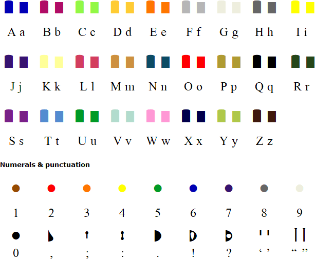
The hex code for each letter is as such, converted from their corresponding RGB values:
| A | #0000B4 |
| B | #AF0D66 |
| C | #92F846 |
| D | #FFC82F |
| E | #FF7600 |
| F | #B9B9B9 |
| G | #EBEBDE |
| H | #646464 |
| I | #FFFF00 |
| J | #371370 |
| K | #FFFF96 |
| L | #CA3E5E |
| M | #CD913F |
| N | #0C4B64 |
| O | #FF0000 |
| P | #AF9B32 |
| Q | #000000 |
| R | #254619 |
| S | #792187 |
| T | #538CD0 |
| U | #009A25 |
| V | #B2DCCD |
| W | #FF98D5 |
| X | #00004A |
| Y | #AFC84A |
| Z | #3F190C |
This yields the following alphabet chart, with its punctuations and numerals added as well:
Now of course, when one uses a writing system that only assigns letters or sounds to specific colours, there are several problems we will encounter along the way. The most prominent one being colour blindness, something that disproportionately affects the male population. This makes distinguishing certain colours or hues more difficult than others, posing an accessibility problem when reading colorAlphabet. The method Faur used to assign colour to letter did not account for colour blindness, and as such, colourblind readers might not be able to read certain texts or art as effectively than say, reading the Latin alphabet version of that same text or art.
Other problems would come down to how colour is rendered on certain media, such as CMYK print in contrast to RGB, the exposure of such pigments to light, and other technical issues. Pigments can fade over time when exposed to light, particularly ultraviolet light. Such fading could change the meaning of the printed text, or even distort it altogether. Additionally, colours may appear different on different screens, or even under different light. For example, my white wall appears off-white or slightly yellow under a warm light. One approximation is #FFFFFF, or white, appearing more #FFFFE4, off white (one of its variants, I am not a colour expert), to me. Night shift screens are warmer in tone, making white slightly off-white as well. These would have implications on displaying colorAlphabet and reading it, since the meaning of each colour is mapped to a letter. So yeah, colorAlphabet is pretty much more aesthetic than practical.
These problems are acknowledged by Faur in his website, but as it stands, the 26 colours of colorAlphabet remain. Nevertheless, this has not stopped the publishing colorAlphabet versions of books like The Little Prince, most notably, in the Turkish version of colorAlphabet (Küçük Prens), translated by Gülce Ekin Köse. And it’s true, an sample page could be found here. Further examples of colorAlphabet being applied could be found in more of Faur’s art, which you could find on his website. And if you want to play around with the colorAlphabet, he has a text-to-colorAlphabet converter here.

very interesting! do you cover any conlangs? i have one called halacae and i think it’s interesting
LikeLike