The Japanese kanji system is infamous for its difficulty for new learners to pick up, with various readings, stroke orders, and compound words formed from these characters. There are several thousand kanji characters in regular use today, with just around 2000 of them being taught in Japanese schools, and perhaps in Japanese classes following the Japanese Language Proficiency Test.
There are several estimates concerning how many kanji characters have ever existed. With different character variants, or even regional varieties, and perhaps the several ghost characters that have popped up once in a while, this number can get really murky. Nevertheless, the consensus is, there are many thousands more kanji characters that have been in use at some point in the history of the Japanese language, with the upper bounds putting this estimate at upwards of 50 000.
Despite its huge number, kanji is representative of Japanese culture, especially how new characters have been natively innovated over time. Characters like 匂 (nio-[u], smell, fragrance) are uniquely Japanese, which have never been written or used before in Chinese characters, the original writing system that was introduced to Japan way back in the day. And so, this innovation of characters is reflected in an annual Japanese contest wherein participants create their own new kanji characters.
This contest is called the Sōsaku Kanji Contest (創作漢字コンテスト). Inaugurated in 2010, the Sōsaku Kanji Contest is a competition organised by Ritsumeikan University, a private university in Kyoto, and sponsored by the Sankei Shinbun newspaper. It must be noted, that even though ‘new’ kanji are proposed in this contest, the winning entries do not enter use in dictionaries, nor are they digitised.
The rules of the contest are relatively straightforward. Create a kanji character reflecting a certain theme, such as aspirations for life, the world, or modern Japan, and attach a proposed pronunciation (kun’yomi), definition, a rationale behind its design, and examples where this kanji could be used. Winning entries may be awarded vouchers or gift cards worth from 2000 JPY to 50000 JPY, depending on the type of award won. Some awards may also be supplemented with a free book such as Shirakawa Shizuka’s Zitong (Popular edition) or 字通[普及版] published by Heibonsha. These winning entries are also published in the Sankei Shinbun, the newspaper which sponsors this event.

Winning entries in 2020 revolved around a single theme, that is the COVID-19 pandemic. In that year, several winning characters featured carried some meanings connected to actions or things seen during the peak of the COVID-19 pandemic. One of them is pretty much famous now, which is the one that depicted ‘social distancing’, using the base character 座 (sit, seat) to play around with. In the original character, the two constituents 人 mean ‘person’. And so, by shifting one of them, you could see how this depiction of social distancing may be done and expressed in a single kanji character. I must admit that it was through the 2020 contest where I was introduced to this contest as a whole, and took me quite a while to decide which ones were my favourite of all time.
Even idioms and proverbs may be summarised into a single character. Perhaps one of my most favourite ones is the character that translates to ‘showing one’s true nature’, or 馬脚を現す (ばきゃくをあらわす, bakyaku wo arawasu). Submitted by Sugimoto Shouji from Kawasaki city for the 5th contest, this character revolves around the kanji character for horse, 馬. It is a pictogram wherein the four strokes at the bottom are meant to depict the horse’s legs, with the hook meant to depict the horse’s tail. Sugimoto’s interpretation of that hook stroke seemed to suggest that it is a cover for something, and so by placing two of the strokes outside the hook, Sugimoto’s creation would depict a horse showing its legs, the literal translation for ‘showing one’s true nature’.

And without further ado, I would like to present five of my most favourite awardees in the years this contest has been held!
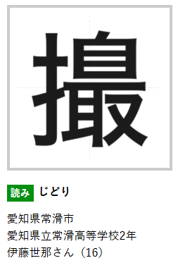
This one above is a character for selfie, jidori 自撮り. As you may pick up from this structure, the character entry is a portmanteau of the character for self, 自, and the character for the verb ‘to take a photo’ 撮. I think this is a pretty neat way of adapting some terms into contemporary lingo, and it is a great start to introduce how some of these characters would appear.

This character represents that of a folding umbrella, or 折り畳み傘 (oritatamikasa). The main character this is based on is that for umbrella, kasa (or san) 傘. The main ingenuity behind this entry though, is representing how the spokes are folded when the umbrella is folded. It is one of the more unusual ones here as the radical representing the folded spokes do not use basic strokes that we commonly use when writing kanji or even hanzi characters.

Representing the expression 記憶にございません (kioku ni gozaimasen), or ‘it slipped my mind’ or ‘I do not have any recollection’, this character is based off that meaning ‘brain’, 脳 (nou). Just that for this one, the strokes within the radical and another element are removed, suggesting that the brain is empty, devoid of memory. And hence the meaning.

As the character’s appearance suggests, this means ‘winner’s podium’, the thing that medalists of sporting events stand on when they receive their medals. In Japanese, this actually translates to 表彰台 (hyoushoudai). However, this character is based on the existing kanji 凸 (Go-on tochi, Kan-on totsu, Kun-on deko), which means protruding or convex (in contrast to 凹, which means ‘concave’ or ‘indentation’).

To cap today’s light-hearted essay, this character here means ‘to walk with one’s head down [looking at a smartphone]’. Another pictographic representation, this character alludes to people’s posture as they walk while looking at their phones. This entry is based on the character ‘to look’, 見(る), or mi(ru), or ken, but with the top element (the bottom two strokes make up the radical) tilted as one would tilt there head to look at their phone. 見 itself could be thought of as a pictographic representation of an eye on two legs, and hence the meaning.
You could learn more about the contest and past winning entries on their website.
