If we hover onto language selection menus in some websites, we would come across two distinct formats, an entirely text-based menu detailing the name of the language (in some cases, in that respective language), or languages as they are depicted using a country’s flag. Examples of the former include Wikipedia and Windows language preferences, while examples of the latter include Clozemaster, and many other language learning applications. This has undoubtedly stirred controversy in the field of localisations and user interface design, drawing support and criticism for one form over the other.


Before we dive into the debate, I want to look into why flags are even used to represent languages in the first place.
For one, flags are colourful, and are eye-catching. They convey a universal representation of a particular country or part thereof, and perhaps the most commonly-spoken language there. When we see the flag of the United Kingdom, we would know for certain that by selecting it, we will see the content in British English. Similarly, when we see the Russian flag, we will see the content in Russian. That much is true, as long as there is a one-to-one correspondence between a country or a state and a language or for languages like English and Chinese, a prominent variant of the language.
This visual argument is perhaps the most common reason why these languages are represented by a country’s flag. But another argument for using flags is the resource-based argument. In some interfaces, space can be limited, and perhaps the designer might want to save on resources allocated to a language selection menu. In which case, a country’s or a state’s flag might just be preferable, since a flag icon might save more space than a language in that respective language. 🇫🇮 would save more space than Suomi, for example. Furthermore, it is probably more visually recognisable than the abbreviation “FI”.
But the issue is, flags are a symbol of national identity, or a certain territorial identity. It does not necessarily represent the language spoken in the country. Sure, French is most associated with France, Italian with Italy, and Japanese with Japan, but what happens when you have languages spoken in many countries across the world, or languages with large native speaker populations within a certain nation?
Case in point, the languages of India. While Hindi is perhaps the most commonly spoken language in India, so too are Gujarat, Punjab, Malayalam, Assamese, Telugu, Tamil, and Marathi. But these languages are all usually represented by the Indian flag. If the language selection menu supports several official languages of India, would using flags to represent these languages be the right choice?
Conversely, we have languages like German, with speakers across the countries of Germany, Austria, and Switzerland. While we associate German with, well, Germany, what implications would this choice have for Austrian and Swiss users who use German?


Another example we see rather often is the debate about representing the Portuguese language using flags. While Portugal comes to mind when it comes to the language, Brazil has a considerably larger Portuguese-speaking population than Portugal. Representing the Portuguese language (and perhaps, the Brazilian variant) has led to some interesting results.

While a solution is to just use the abbreviation “PT” or “POR”, or the language Português, further challenges are posed when it comes to considering the differences between Portuguese Portuguese and Brazilian Portuguese. Perhaps to account for this, we could take lessons from the representation of English, which uses the flag of the United States, or the United Kingdom, or as the abbreviations “EN” or “ENG”. Abbreviations accounting for the differences in the variants of English may be represented using “BrE” and “AmE” for British English and American English respectively, or as “English (UK)” and “English (US)”. Similarly, Portuguese could be represented using “Português (PT)” and “Português (BR)”.
To summarise, a common takeaway is, languages transcend borders, while flags enforce borders. Thus, the usage of country, state, or territorial flags is not ideal in representing languages in language selection menus or interfaces.
So, what are some improvements designers are advocating for?
One of the solutions is the ISO-639 abbreviations. These are two- (ISO 639-1) or three- (ISO 639-2) letter abbreviations of languages or language groups. We see examples of this in the ÖBB homepage, and even the language preferences section in the Windows hotbar. German would be DE (or DEU), French would be FR (or FRA), and Hindi would be HI (or HIN). While most of these well-known languages have intuitive abbreviations, there are some inconsistencies.
For example, Spanish is ES under ISO 639-1, abbreviated from the language name Español, but it is SPA under ISO 639-2. Similarly, Swedish is SV under ISO 639-1, abbreviated from Svenska, but it is SWE under ISO 639-2. One method to resolve this is to use one system of abbreviations consistently. Most websites adopting this solution apply the ISO 639-1 codes in their language selection menus, for example. This allows representing languages without making references to specific countries or states.
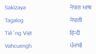
Another solution is something like what Wikipedia uses. By using the name of the language in that respective language (and writing system), it would be recognisable to speakers and users of that specific language. Thus, Polish would be represented as Polski, Croatian would be represented as Hrvatski, and Bulgarian would be represented as Български.
One problem with this solution is availability of support of certain writing systems, which could affect rendering in these menus. Differences in writing direction (compare Arabic and Hebrew scripts against Latin and Cyrillic), joined letters especially in Arabic, and certain writing systems (like Tibetan) might not be accounted for in some designs, which leads to rendering or formatting issues in language selector menus. Sometimes, these characters might be erroneously rendered, appearing as boxes, or gibberish in systems that do not support those characters. Even languages like Vietnamese are not immune to this problem, as diacritic support might cause rendering issues in the menu, like in Wikipedia:
While these solutions proposed are predominantly text-based, the identification of language preferences could still be visual. One of the more common ones is to use a global icon to represent language preferences, which when clicked, would open up the menu of available languages for the user to switch to.
In the grand scheme of website design to enhance user experience, considerations have to be made to cater to an extremely diverse audience. With the controversy country flags attract in language preferences, it would be a great consideration to move on from these representations to solutions like those proposed above. Sure, each alternative has its own problems and downsides, but it would generally be better practice than flags and their associated controversies.
And lastly, yes. It is a huge irony for a website like this one, dedicated to languages and language learning, and commenting on language selection menus, to almost lack any support for content written in languages other than English (and by extension, lack a language selection menu in the first place).
