While trawling the Internet for interesting phenomena in any topics in language and writing, I came across this post that was spread around various pages. This one talked about the time when a certain handwriting was banned in schools across Japan.

The reason for the banning was it being “too illegible”. In fact, some sites like this one described it as a “crisis” striking the Japanese education system. Looking past the grammatical error in this example, I thought such a discourse was a bit too exaggerated.

Scrolling to the comments, I saw how some of them mention that it was perfectly legible to them, even as beginning learners of Japanese. So today, I want to dive into this topic, what is the story behind this type of penmanship, and what exactly led to the banning of this handwriting in schools?
This aesthetic of handwriting, called cute handwriting or kawaii handwriting, was inspired from the rise of the kawaii aesthetic and kawaii culture, where styles were made to look cute or loveable. Cute handwriting was characterised as having the following:
- Horizontally written (from left to right), contrasting with the vertical direction in tradition Japanese writing
- Big, rounded characters which were heavily stylised
- Addition of other features such as various pictures, stars, hearts, emoticons, and even letters of the Latin alphabet

Many sources seem to attribute the rise of cute handwriting to the popularisation and use of mechanical pencils. During the late 60s and 70s, Pentel and Pilot were heavily involved in developing new advancements in mechanical pencils, with Pentel releasing 0.5mm and 0.7mm pencils in 1962, and 0.3mm ones in 1968, and Pilot releasing the 2020 series pencils in 1978. These pencils produced fine and even lines, contrasting with traditional Japanese writing where stroke thickness varied. Nevertheless, these fine leads were deemed suitable for writing Japanese kanji.
But the rise of cute handwriting could also be a cultural thing. You see, Japan is known to have a society where conformity is key — there are certain ways to write stuff, behave, speak, you name it. And this sort of handwriting, according to Yamane Kazuma, was invented and predominantly used by middle and high school students. Being teenagers, this demographic is associated with descriptors like “rebellious”. Combined with the popular culture of the 1960s and 70s when new fashion, retail, and various mass-media were introduced to Japanese society, these factors could have culminated in the teenage drive to ‘rebel against tradition’. These took place in ways beyond just cute handwriting — it is also when we see the gyaru (or hyper-feminine) sub-culture appear, alongside music, and other forms of kawaii fashion.
Another factor is the use of the left-to-right writing direction of Japanese. As romanisation of Japanese text occurred, so too did the use of left-to-right writing of Japanese text, as opposed to the top-to-bottom, right-to-left writing direction traditionally used. This allowed the blending of English words into Japanese text relatively seamlessly, facilitating the youth’s rebellion against Japanese tradition and identifying with Western cultures.
The banning of cute handwriting in schools was actually real. However, there could be different perspectives in interpreting the reasons for such a ban. For one, schools do enforce discipline, or more rather, conformity. The rise of cute handwriting in schools could gave gone against the conformist principles in school (and society), which resulted in a ban, and a hard push towards conforming to “normal handwriting”.
Perhaps the more obvious reason is the illegibility of cute handwriting when things get a little too much. The rounding and stylising of even hiragana characters could make some of them appear different from the written form we are more familiar with, such as the character so (そ) in the figure. This issue is further exacerbated when kanji is involved. For example, look at the kanji in the response to item 8 in Yamane’s research:
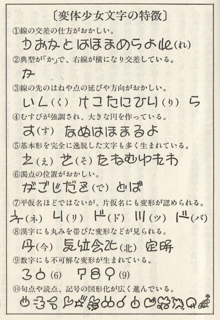
Numbers and punctuation marks were also stylised, and the latter could have been altered such that the style would reflect the mood or emotions the writer was experiencing when they wrote that sentence. But yes, when pushed a bit too far, characters would appear a bit too removed or deviant from conventional written forms, print forms (or even calligraphy forms) such that they were illegible. And as many sources point out, this was one of the main reasons why cute handwriting was banned in schools. There were reports of expulsions from these sources, although no further information could be found. As such, the punishments or penalties a student could face would vary, but what they really were was up for debate, unless someone would like to share their experiences here.
Despite the banning of cute handwriting in schools, this type was still adopted by magazines, manga, and the packaging of various products marketed at younger audiences like children’s toys. And one could find this aesthetic in various places in Japan today. With this, came along more names for this type of handwriting, including marui-ji (丸い字, round writing), koneko-ji (子猫字, kitten writing), and manga-ji (マンガ字, manga writing). Perhaps one of the earliest, and still famous, examples of this incorporation into products is Sanrio, which launched Hello Kitty way back in 1974, alongside all sorts of merchandise. I am not sure if cute handwriting is still banned in schools today, but it is pretty safe to say that it has certainly left a legacy in various Japanese subcultures.
Further reading
Kinsella, Sharon. 1995. “Cuties in Japan”
Yamane, Kazuma. 1989. “変体少女文字の研究” 講談社文庫
